Is HostGator better than Wix and Weebly?
The short answer is…
(1) HostGator is the least expensive for the first two years,
(2) Weebly is the easiest to use (unless you know certain things about Wix which I explain later in this article, and then Wix is the easiest to use) and
(3) Wix has the best designs.
So which one is better?
At first glance, the answer seems pretty obvious, right?
It’s whichever category—price, ease to use or appearance—is the most important to you.
But what if two categories (or all three categories) are equally important?
That’s what happened to me, and here’s what I did to figure it out.

But first there’s something you need to know: I’m website challenged.
I struggle with design.
I’m not techie.
And I get hung up on small details that stop me dead in my tracks BUT (and it’s a big “but”), I don’t want to pay a website designer to build a website for me. For better or for worse, I’m stuck with me.
The HostGator, Wix, Weebly Experiment
So, to figure out which website builder worked best for me I ran an experiment where I built the same website (content, theme picture, pages, including a blog) on three different website builders (HostGator, Wix, Weebly).
This is how I compared them: 1. ease to build 2. price, and 3. appearance.
HostGator, Wix and Weebly are all drag and drop website builders. And, believe me, that’s what you want if you’ve never built a website before.
You already know the ending of the story. I found that…
Weebly is super easy to use.
HostGator is the cheapest for the first two years.
Wix has the best designs.
But there’s more to this story than meets the eye.
Once you see the websites that I created and start to think about building your own website, your opinion about which category is the most important for you might just change.
It did for me.
By the way, if you’re really want your blog to be the central feature of your website (at least one blog post per week), read this first.
Before we get started with the comparison, I want to be crystal clear and tell you that the Hostgator, Weebly and Wix links below are affiliate links.
That means if you purchase through one of them I get a commission. But you don’t pay more for purchasing through a link.
I also want to mention that I chose these 3 website builders to compare because I have researched and built websites on all three platforms. And I only recommend products/services that I think are helpful.
If you do sign up through a link, thank you for supporting my work.
And if you ever have a question/issue regarding Hostgator, Wix or Weebly, come to me, let me know below and I’ll make sure that you have an answer/solution.
This is my email address: mark@makethemostofmassage.com
Sound good?
Okay, let’s get down to business.
1. Ease to Build
Here are my EASE TO BUILD rankings:
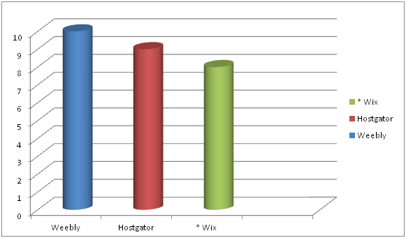
First you need to know that all three website builders–Weebly, HostGator, Wix–are solid website builders and doable for the novice website builder.
Wix can be the most difficult because it has many more design options for the users than Weebly and HostGator.
But note that there is an asterisk next to Wix.
Why?
Because Wix has a design feature that makes things way easy.
Combine that with some key hints about navigating the Wix dashboard and Wix was easier for me than Weebly. More about that later.
HostGator is very straight forward and easy to use, but with a couple of things not quite as easy to use as Weebly.
Mobile View
For instance, when you’re building your website you’ll be building a desktop version and a mobile version.
So, basically what is built on the desktop needs to get smooshed into the the mobile version.
Well, not exactly smooshed.
But it’s not going to look the same as your desktop view because it’s going to have fit on a much smaller screen.
With HostGator and Wix you always need to check what your mobile view looks like because their smooshing doesn’t always look right.
With Weebly, you don’t have to monkey with your mobile version. In fact, you can’t.
Weebly’s smooshing is supposed to represent the best version you could possibly have within their framework.
That’s super easy for the person building the website, but it’s also the most limiting of the three in terms of being able to control your design.
2. PRICE
My ranking order for PRICE goes:
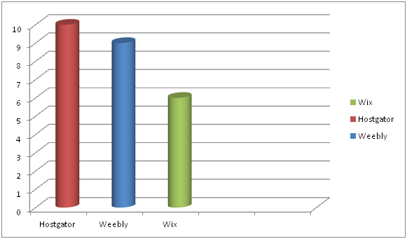
HostGator nudges out Weebly in terms of best pricing–but only for the first two years.
Before I get into the details of the whole pricing picture I want to talk about Weebly and Wix’s free website builders.
They are like writing you contact info on a napkin and calling it a business card.
Okay, maybe not quite that bad, but unprofessional in my book.
For one, your domain name will be complicated and look cheap.
If your business in called Annie’s Massage and you own the domain name www.anniesmassage.com, your free version web address will be something like www.anniesmassage.com/wixfree or www.anniesmassage.com/weeblysite.
Imagine putting the free version web address on your business card.
It’s going to look unprofessional.
And are potential clients going to remember to do the / and type in everything after that?
The other big issue with the free versions is that your websites will have ads them that you don’t control.
Hopefully none that advertise for Hand & Stone. Lol.
Website Builder Essentials
Here’s what I think is important when purchasing a website builder package:
No ads if possible.
Free domain name.
A basic plan. (You don’t need the PRO, BUSINESS or GALAXY website package deal).
Ideally, it’s more professional looking to have email with your domain name address, but you don’t need that right away.
Okay, now to the pricing of the paid plans.
Website with Domain Name Email Pricing
To keep things clear, below is the pricing structure if you purchased your website builder/service at the cheapest offering of each provider with domain name email.
HostGator’s cheapest offering requires a 2-year commitment paid upfront.
Weebly’s cheapest offering requires a 2-year commitment paid upfront.
Wix’s cheapest offering is month-to-month.
| HostGator | Wix | Weebly |
| $46.08 ($3.84/month for a website) |
$156 ($13/month for a website) | $48 ($4/month for a website) |
| $60 ($5.00/month for email) | $60 ($5.00/month for email) | $60 ($5.00/month for email) |
| $106.08/year | $216.00/year | $108.00/year |
Cheaper Pricing
If you want to just use your personal email instead of a domain name email, you could knock off $60 across the board.
| HostGator | Wix | Weebly |
| $46.08 ($3.84/month for a website) | $156 ($13/month for a website) | $48 ($4/month for a website) |
| $46.08/year | $156.00/year | $48.00/year |
HostGator and Weebly are quite the price deals. But there is more to this pricing.
After 2 years, the HostGator $3.84 special pricing goes to normal pricing of $7.68/month.
So, HostGator will save you a few bucks over Weebly the first two years but it will cost your more the subsequent years.
Long term Weebly is the better price deal, BUT also worth noting is that if you go with the cheapest HostGator plan there will be NO ads on your website.
The cheapest Weebly plan has Square ads. You have to upgrade to Pro ($12/month) to get rid of the Square ads.
| Years | Cheapest | Price Advantage | Disadvantage |
| 1 & 2 | HostGator | HG – $46.08/yr W – $48/yr |
No ads on website |
| After 2 | Weebly | W – $48/yr HG – $92.16/yr |
Square ad on website |
At this point, if you’re super-economizing, you’re thinking it’s a toss up between HostGator and Weebly.
But there’s a wild card that we haven’t talked about. And it’s: What is the website going to look like?
3. APPEARANCE
Here are what my three websites look like: 3 Website Video
Which one do you like better?
If you’re like me, you like the look of the Wix Test Site the best.
My APPEARANCE ranking goes:
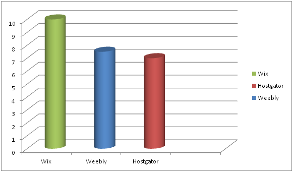
But wait, is it a fair comparison?
There seems to be a lot more pictures on the Wix website.
Well, I started out this experiment by saying that I was going to use one stock image and the same content on each website.
I built the HostGator and Weebly websites first—and I was, for the most part, able to do that no problem.
The Wix Experiment
Then I got to Wix and the experiment started to unravel.
Why?
Because Wix’s designs are like a paint-by-numbers picture.
And you don’t want to leave out a color because you want your painting to look exactly like the picture on the box!
Seriously.
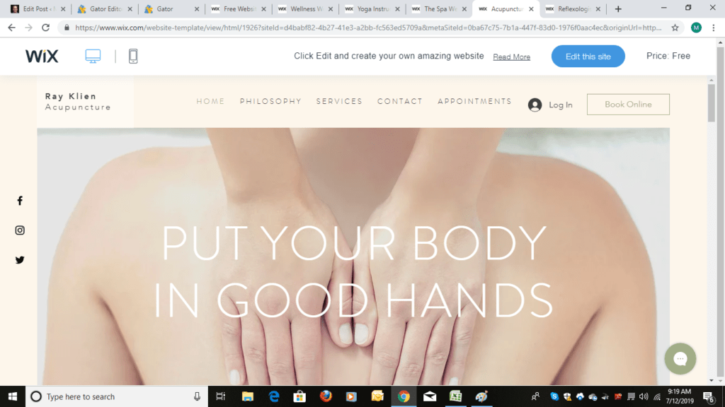
For starters Wix has templates designed for massage therapists, not just spas.
That’s huge because then you have to do less editing to make the template work for you.
But my initial experience using Wix wasn’t all angels singing.
It was punctuated with moments of me grabbing my face and wanting to pull it off in frustration until I figured out things on the navigation dashboard and started using ADI (Artificial Design Intelligence).
Then it was smooth sailing.
So, if you ultimately do go with Wix, I don’t want you pulling your face off.
I made you a How Not to Pull Your Face Off with Wix Cheat Sheet and I walk you through using ADI at the end of this article.
Once I had my cheat sheet and went the ADI route my EASE TO USE rankings changed to:
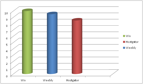
By the way, if you’re good at design, Wix gives the most control of what you can change in the design element.
So, as you may have guessed by now, the appearance category which was 3rd in my ranking as to what was important initially moved to 1st as I went through the experiment of building a website on Wix.
But that’s me.
What about you?
HostGator
Go with HostGator if you want a great PRICE with no ads.
Click on Starter package.

Then on the next page you fill everything else out including domain name.

Weebly
Go with Weebly if you want a great long-term price and you don’t mind having a Square ad on your website. (You can always upgrade to get rid of the ad at anytime.)
Here’s how to get through checkout on Weebly without getting lost.

If you select the Connect option you’ll get more pricing options, but first Weebly wants you to sign up.

Now comes the other pricing options in Connect:

The 2-year Connect option is $4/ month (the 2 years need to be paid upfront).
The 1-year Connect is $5/month (the 1 year needs to be paid upfront).
You can also go month-to-month for $8/month.
The ProPlan at $12 gets the Square ad off your website.
Once you select your plan you will be taken to the payment section:

Fill that out and you’re in. You’ll go to your dashboard and then select a domain name if you don’t already have one.
Wix
Go with Wix if APPEARANCE and EASE TO USE (following my tips) are number one on your list.
And you can totally experience Wix ADI before you even whip out out your credit card.
Here’s how you do that. Go here and click on Start Now.

Then click on sign up.

After you sign up (no money paid) the coolness begins.

Start answering the questions.

Keep going.

Because you will quickly get to a screen…

…that says this: ADI (Artificial Design Intelligence)!

It will only take a few more minutes to answer questions like this:

You can see where this is going.

And before you know it…

You are here.

And BOOM your website design is practically done.

Changing things like theme colors is simple and ADI offers suggestions.

You can finish the entire website without paying.
BUT if you want your domain name attached to the site with no ads and want the ability to sell gift certificates, take credit cards, do online bookings and run a business then go to the upgrade tab and purchase the $13/month plan.

And if you go with Wix here is your cheat sheet. Below that is help with content on your website.
How NOT to Pull Your Face Off with Wix
1. Don’t ever use their internal “search for help”. It will make you bang your head against the wall. Do a Google search instead.
2. If you want to save time and don’t fancy yourself a designer, try their ADI (Artifical Design Intelligence) option, like I just showed you. That’s what I did and it worked like a charm.
It will ask you a series of questions and then provide you some template options based on your answers.
Key words that I went with were “massage therapist” and “minimal”.
3. Don’t be afraid to delete a section if it doesn’t work for you.
4. Check mobile view and edit it if you need to.
One of my issues in the mobile view was wording in on one section of my website was washed out because of the background picture.
You can go to advanced features and mess with stuff or you can simply click on the section in mobile edit and select a new design for that section.
Content for your Website

After you’ve selected a website builder (or if you have one already), go to Step #2 in my How to Build a Massage Website Guide so that you can create your Home, About and Services page.
Keep the momentum going!
There’s only one more NOT-big step after Step #2.
Soon you’ll have a brand, spanking new (and effective) website!
Remember if you have a website question about Hostgator, Weebly or Wix, I’ve got you’ve covered:-)


